

My latest illustration for my portfolio is a piece of “spot illustration” – something that can stand alone, but doesn’t feel like a “one-off”. I saw this photograph appear in my newsfeed. This is the daughter of one of my University friends, and I just had to use it as my reference.
When creating art, lately I have found that using a reference (or a number of references) has allowed me to create stronger pieces. I had received a lot of feedback about my art not quite working because the references were clearly missing. We can only draw so much from our imaginations; it is good to use reference material! My critique partner, Jami, has really pushed me in this area (thanks Jami!).
I’m going to share bits of the process in this post. If you’re a teacher, or the parent of an artistic kid looking for a push, you could study this process for an art lesson. If you’re an artist or wondering about references and digital and blah blah blah, this may give you some ideas.
So, here’s the original image:

Adorable, right? This kid is so freakin’ cute; I loved the energy and pure happiness that was in the picture. She looks a little bratty, too (in the best way), and I wanted to maximize on this in my character design. I didn’t want to make a true-to-life replica; I wanted to use this as a reference, and then build on it in my own style.
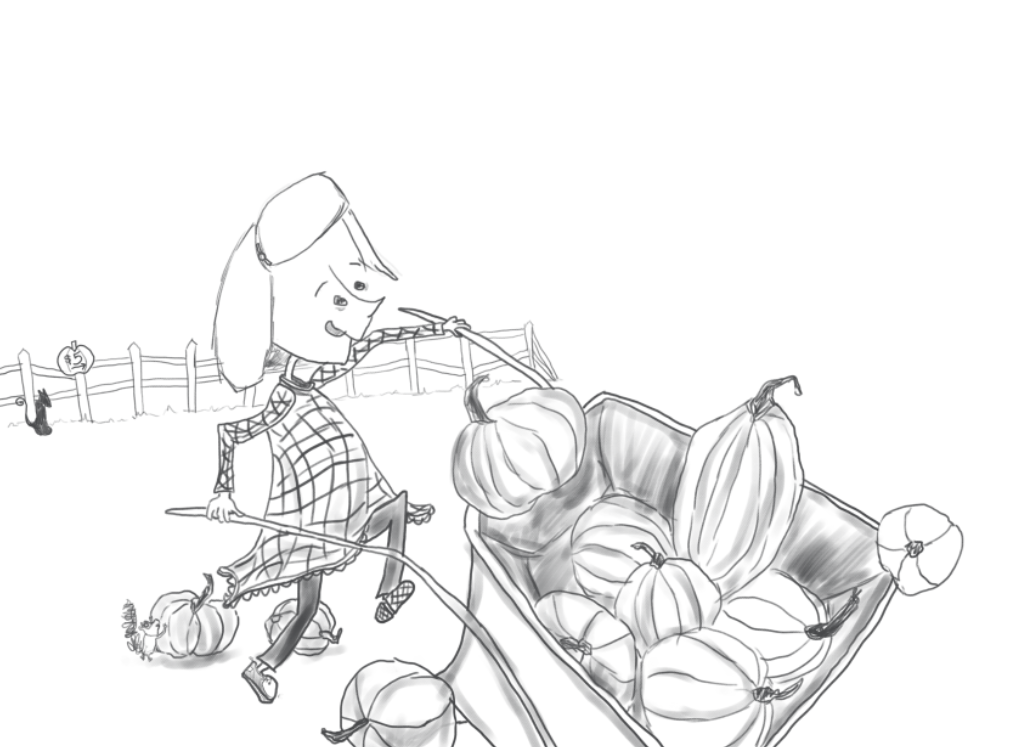
I started with a LOT of sketches. Here are some of the ones closer to the finish:

Both my critique partner and I really liked most of the structure in this image. There were some issues though. For one thing, the cat along the back fence was placed right above the squirrel and the pumpkin. Structurally, this bothered me. I wanted to push the use of triangles in my structure, which I had achieved between the head, to the pumpkin pile, and then down to the wheelbarrow. I decided I would shift the cat over to the left, and create a smaller triangle between her head, the squirrel/pumpkin and the cat. The other thing bothering me was the face. It wasn’t working. The style was all wrong – nothing special or stand-out. I sketched a number of other faces, eventually coming to this pointed nose approach, and then played with that:

 My plan was to use one of these heads on top of the old head, when I brought everything into photoshop. That will be shown in a few seconds, but first I want to point out an area of concern for my partner. She suggested that the image I was referring to was causing an issue. The perspective in that image was coming from the parent’s eye view – a photo shot down from higher up. I was trying to take a head-on approach, which I continued to want to use. She sent me this image to help me see how I could work on it. You’ll notice that the horizon lines were really all that needed the most fixing.
She actually used a photo of my son to help work on the issue:

I brought photos of my sketches into Photoshop and moved some things around. This is the REALLY ugly part. I cut and pasted the cat into a new spot, and changed the size slightly. Then, I erased the old head, brought in the sketch of the head I wanted to use, and resized/angled it so that it looked more uniform with the body. Next, I changed the horizon line.

I turned down the opacity of these layers so that I could sketch, using my Wacom tablet, over top:

Then, I removed the original sketches entirely.
Next, I added the background details and some shading. I also changed the tongue sticking out, because my wife (who is just as skilled with constructive feedback as my art critique partner Jami is) suggested that it looked like she wasn’t wearing her dentures. Eep! Not the message I wanted viewers to leave with, so I fixed the mouth and then got to work on the background.

I used color.adobe.com and searched for the following terms to help me identify my color palette: harvest, pumpkins, pumpkin patch, skin, hair. Note: I have a subscription to the entire Creative Cloud, so I can easily use any of the Adobe tools. I highly suggest this for digital artists. I complete most of my illustrations in Photoshop, including this one.

I hated the way the dress was looking at this point. I spent a long time looking at samples of clothing in both real photos and in illustrations; at digitally rendered and watercolor renderings (because I tend to use watercolor techniques in the digital setting).
As I got further into the colour, I turned to another reference: The Paper Bag Princess, with art by Michael Martchenko. Now, being a Canadian boy, I grew up with this book and a billion other Robert Munsch/Michael Martchenko books and have long admired his ability to create intense situations and children in various poses and expressions, with so much life. In this case, though, I was looking specifically at the color choices he made, based on a suggestion from my partner, who receives a million Facebook Chat messages a day when I am deep in a project. If you don’t have a great partner yet, you need to find one who you trust, who knows their stuff and who can be honest when your work isn’t working.

Jami had commented that actually building the dress up from the colour of the background might make the work easier. When I saw this image (while reading to Kingsley before bed), what she had said came to life: it doesn’t need to be a total contrast; the tones and hues can be similar between the background and the main subject.
I spent some time trying out a dress in the browns and greens, but it wasn’t entirely working.
I changed the hue to a blue and suddenly it started to come together.
I tweaked the blue using a combination of airbrush (with texture) and watercolor brush settings. Then, I duplicated the layer and set both to “multiply” (this is a great effect; it brings out what it underneath, almost like using a magic marker over a black line would). I called up the “Burn” tool and darkened the edges a tad. You may also have noticed the face: in the photo above, with the bad dress colors, it is darker; however, in this shot, it’s much subtler. I utilized the blending tool, as well as the “Dodge” tool, to pull this off. I think that if you can paint the skin of a character to be unnoticeable, you’ve pulled it off. In my opinion, the stronger artists can do things that look so damn easy, but are difficult to duplicate if you aren’t them. (Disclaimer: I’m not saying that this is me.)
Now I was feeling like it was almost ready. I switched over to greyscale (on a Mac: Command + 4, then try Command + 3 … Command + 2 will bring it back – this has to do with the settings of the color and is another post in itself) to check the quality of the color work. This is a huge piece of determining how finished you are. Most people don’t bother. I am a firm believer in it.

I noticed some shading discrepancies in the wagon, so I fixed them up.
And that was that. I felt good about it even the next morning after some time away. Of course, this is where I am now. In 2 years, I may look at this with new eyes and information and experiences and might pull it off in a whole new way. But for now, I am very satisfied!

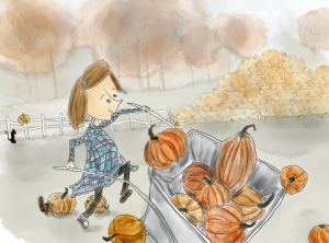
To summarize, from this:
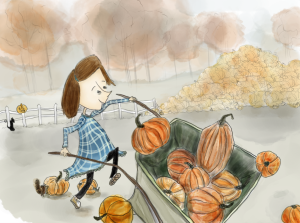
To this:
And onto my portfolio, at art.patrickg.ca.
